


an electronic shopping assistant tool that allows customers to find and locate product effectively.
| Project Type | Dr David Travis User Experience (UX): The Ultimate Guide to Usability and UX online course assignment: "Tomorrow’s shopping cart" |
|---|---|
| Challenge | iCART will allow people to find products in the supermarket effectively with a built-in satnav system. Allow customers to add and edit their shopping lists to generate shopping routes in order to save time in navigation. |
| My Role | Worked by Myself, User Research, User Analysis, Interaction Design, Visual Design, UX/UI Design |
| Design Tools | Sketch, Marvel, Adobe Photoshop, Adobe Illustrator, Adobe Premiere, Adobe After Effects |
The Head of Retail for a supermarket chain located in my area sent over a request asking for a development of a grocery shopping assistant tool through to the prototype phase. And this idea is called Tomorrow’s Shopping Cart. The idea behind it is that it will allow people to find products in the supermarket with a kind of built-in satnav system. And also allow customers to add their list to generate the route. It also could offer recipes of the week and allow customers to add ingredients easily to the list. She also has an idea of adding a barcode reader built-in for customers to checkout without using a checkout machine or waiting in the checkout line. She wants this to be a differentiator for her chain of supermarkets, so an app wouldn’t work for her.
In the age of new media, people’s lives changed dramatically. The way we do grocery shopping starts to change as well. Efficiency becomes a goal of daily grocery shopping.
Through user research, I discovered that many users struggled with navigation inside the grocery store as goods are rearranged too often trying to attract more potential buyers. Also, long checkout lines are not what customers want to see when they are ready to wrap up.
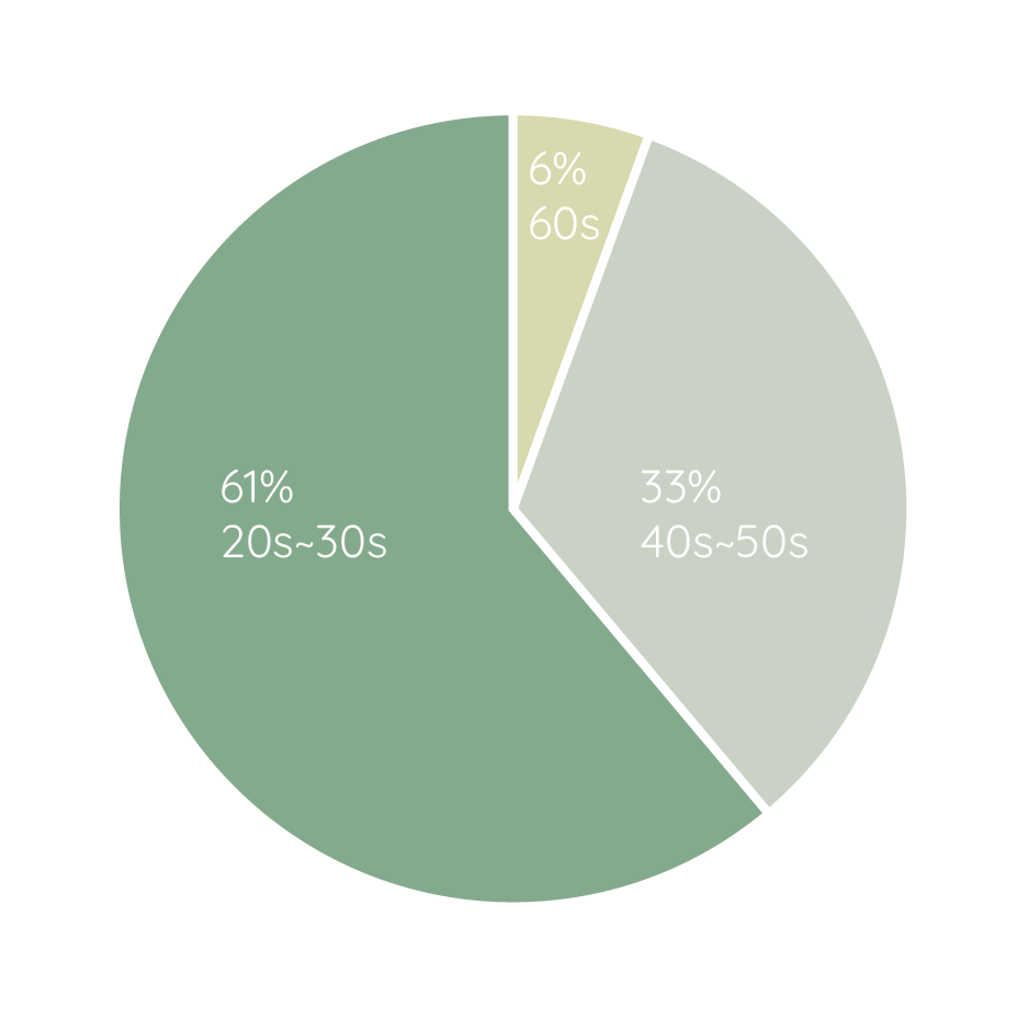
To find out how people might use a system like this. I started this project by conducting an online survey. Out of all 18 pieces of feedbacks that I got, 61% were in their 20s and 30s; 33% were in their 40s and 50s; only 6% were in their 60s. The age pattern was a reasonable sample of the potential user base. The survey asked participants questions about their grocery shopping habits and the problems that they have.
Some survey questions were:
"Do you often go with a shopping list?
"In your grocery shopping trip, what activities waste your time the most? (name 2)"
I also went to local grocery stores and supermarkets to observe customers' behavior. Some of the common patterns I found were:

Shop in groups and walk lane by lane.

Have a list in hand or on the phone and directly go for what they want.

Video chatting on the phone while making decisions.

Ask staff members to help locate a product.

Always look for the shortest checkout lines.

Stop, read and compare in front of promotions.

Have coupons in hand
The following findings stood out in the research:
Hard to find specific items, especially when going to a new grocery store. Locating a product can take the longest time.

During peak hours, for example, weekends, checkout lines are usually longer than usual. Customers need to spend a long time waiting.
Among all the participants, around 60% will shop with a pre-prepared list made up by themselves or other family members.

Around 72% of participants will look at store coupons and sales events. Saving money is a common need.
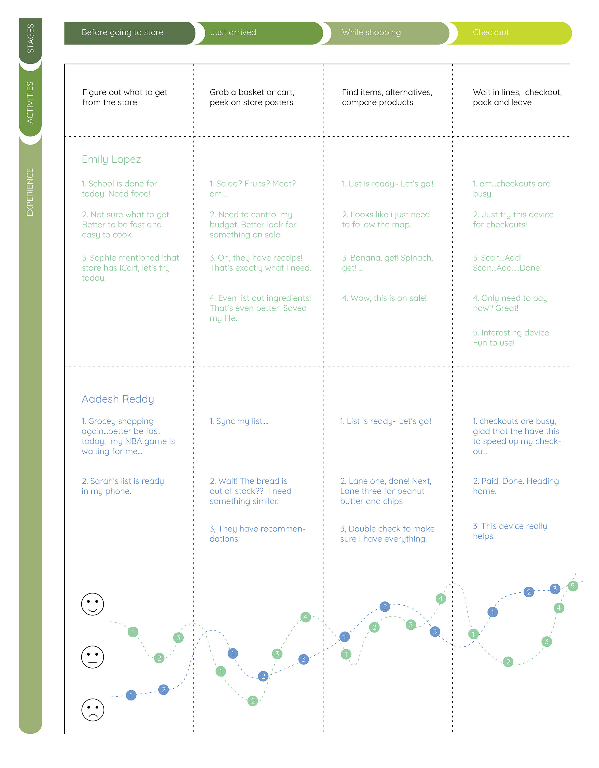
Based on all the research and findings, persona and user journey map were then developed to help focus on the targeted users and generate ideas in the next phase.
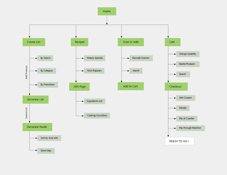
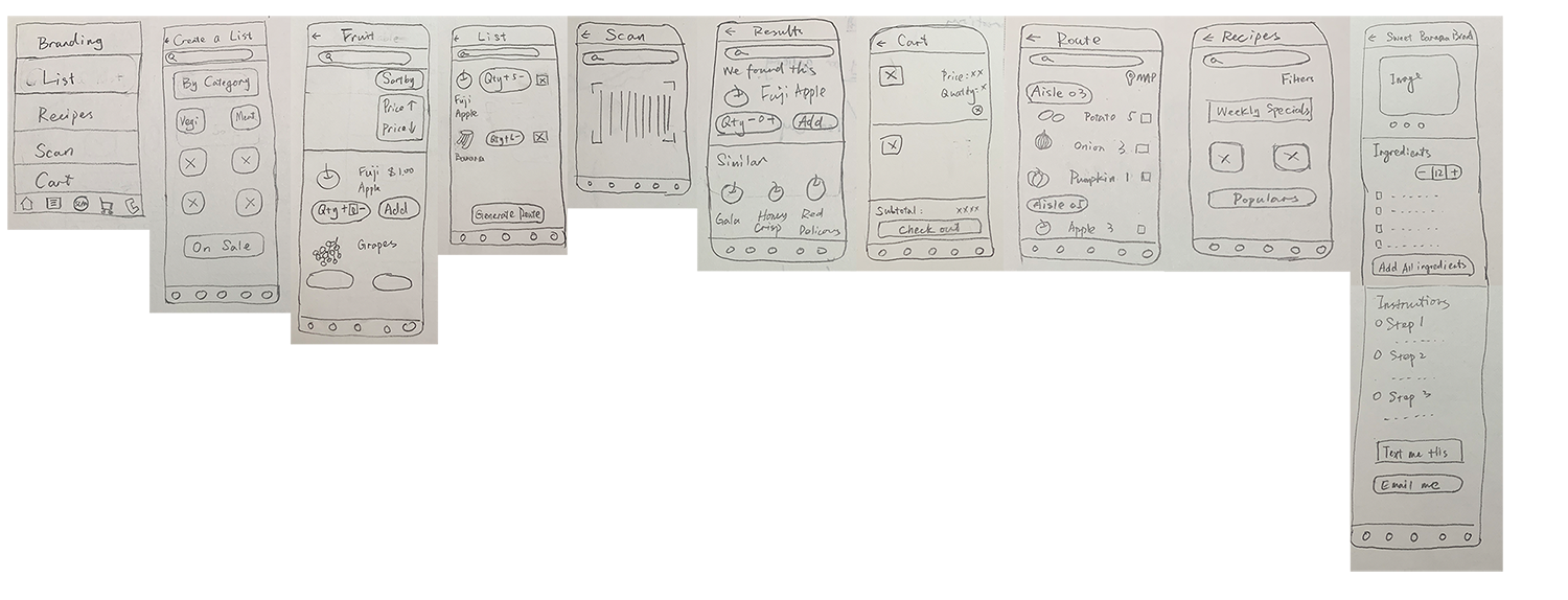
I sketched out possible solutions for several key functions on paper prototyping to help narrow down design ideas.
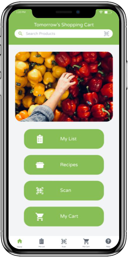
Then I created a mid-fidelity prototype digitally and moved on to evaluate it. So far I recruited 5 users and iterated on the design. Some I video chatted with them and observed them interacting with the product. Some I did face-to-face. I always explained the background and goals of this development to them firts and let them explore.
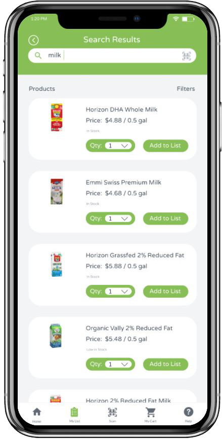
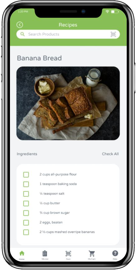
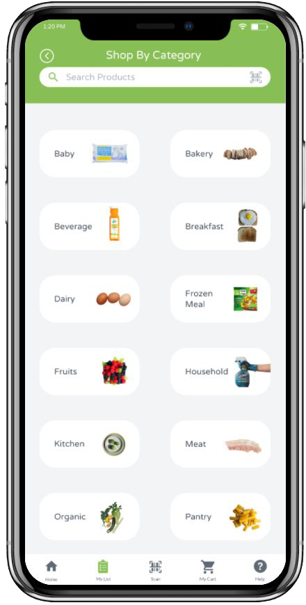
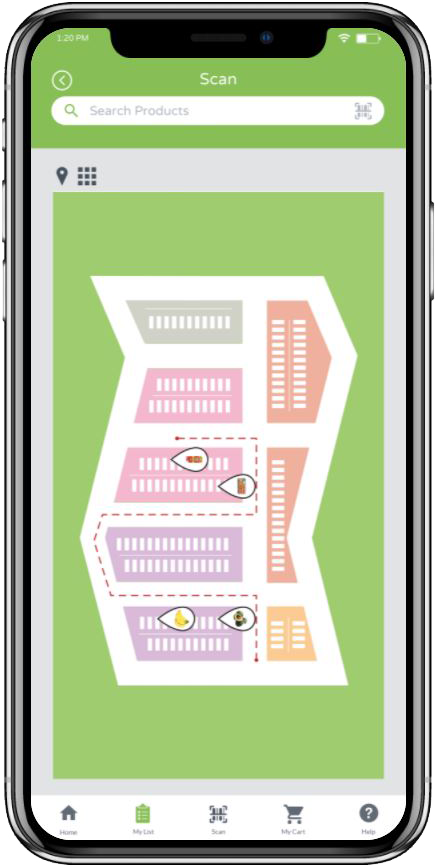
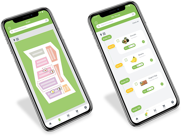
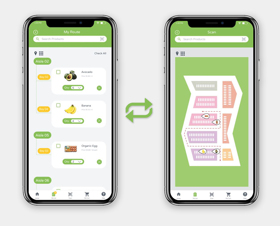
Initially, I thought a list view of the route would be clear enough for the customer to follow and edit. But some users believe that when talking about the route, a map is expected to see here. This reflection made me redesign and add a map view with a route physically presented so that users will know where they are and how to get the next item.
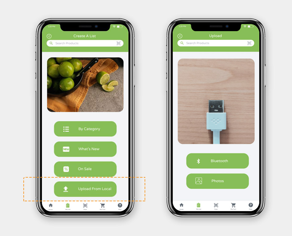
I didn't give too much thought into the necessity of importing a list function before this prototyping. But after that, I realized that many customers do go grocery shopping with a pre-prepared list. I should have included the uploading function to save time from adding items individually, which obeyed the goal of being effective. And the supermarket will benefit from having a smooth traffic flow.
Taking this into consideration, I further explored the way to upload the list. With a digital list in customers' mobile devices, Bluetooth should be a good choice for them to have. For some that have a paper list, taking photos to upload would be necessary.
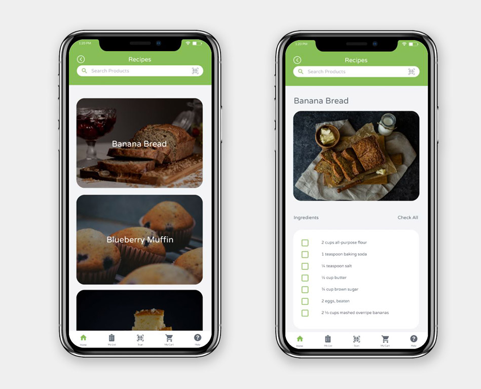
I first designed several categories in the recipe section, like daily special and most popular. But when I observed users interacting with this section, some seemed confused about having this in the device. So I revised it and decided to go straight with this part by listing all the recipes with fewer tabs.
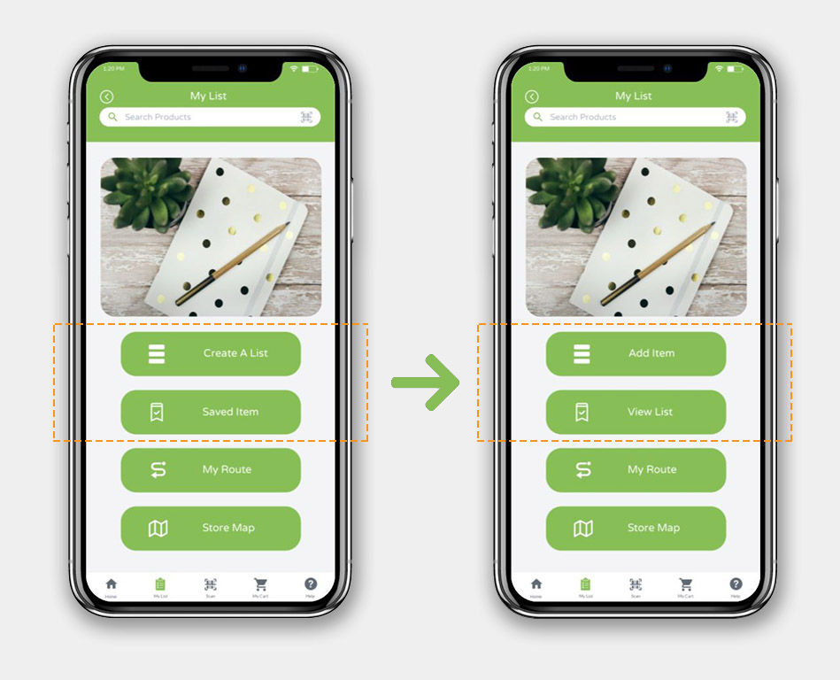
I renamed two function names after one user questioned why the 'Saved Item' section was included in a one-time-use device. The idea behind it was to temporarily store the list before submitting it to generate a route. But then I realized that the name confused the user, so I changed it to 'View List' instead. Accordingly, I updated the 'Create a List' to 'Add Item' so that users will know they can modify the list anytime.
Below is the Mid-Fi prototype. Feel free to interact with the prototype! Your feedback is highly appreciated and will use it to evaluate changes and make improvements in my design.
BONUS! I also made a short video introducing this product. Just for fun!